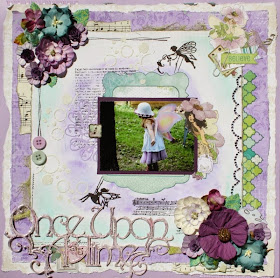
Hello again everyone & welcome to our September photo tutorial by Design Team
member Pam Ellis from Canada. She walks us through one of her signature
shabby chic style layouts today, using our current challenge here.
Pam shared a sneak peak of her layout for our mid month reveal
& now we get to see her whole layout & the creative process behind it!
LET PAM KNOW WHAT YOU THINK BY LEAVING A COMMENT :)
"Hello! My name is Pam Ellis & I live in Gravenhurst, Canada.
I am a retired nurse with a supportive hubby, 5 daughters & 4 grandchildren.
I started scrapbooking in 2007 when my 1st grandchild was born
but only jumped right in in 2011 when I had more time.
My signature style is shabby chic but recently I have been incorporating
mixed media too & loving it! I am a paper junkie & stash hoarder & my studio
has been moved & made over several times due my ever expanding supplies!!
I would love you to follow along with my creative journey by visiting
my blog here. I have an awesome GIVEAWAY going on at the moment
so please come & take a peek!!
------------------------------------------------
1. Choose 1 plain cardstock & 3 subtle-print papers.
Trim down your printed papers slightly to form a layered-up look.
Adhere all sheets together.
2. Ink up your background to match your papers, using chalk ink pads or gelatos.
Place tags & die-cuts on your layout & tuck some torn music papers under your top layer.

3. Using a variety of stamps, stamp images on your layout.

4. Apply modeling paste through a stencil around the inked areas.
5. Apply a coat or 2 of co-ordinating paint onto your chipboard piece.
6. Apply Liquid Pearls to your chipboard then sprinkle
with embossing powder. Heat dry to set.
7. Add your photograph, flower clusters, buttons,
crystals & chipboard to complete your layout.
Here are a few closeups.
Tucking in off-cuts of ribbon & papers is a great way to add interest to your layouts!
Stamping & masking is always a great way to add subtle detail.
Papers - Bo Bunny
Paint - Deco Art
Flowers - Bo Bunny & Petaloo
Stamps - Bo Bunny & Prima
Mask - Memory Box
Buttons - Bo Bunny
Bling - Prima
Embossing Powder - LSG
Mica Powder - Luminarte
Ink - Colorbox
Paint - Deco Art
Flowers - Bo Bunny & Petaloo
Stamps - Bo Bunny & Prima
Mask - Memory Box
Buttons - Bo Bunny
Bling - Prima
Embossing Powder - LSG
Mica Powder - Luminarte
Ink - Colorbox
Please leave some feedback for Pam if you benefitted from this tutorial!


This is a FANTASTIC tutorial & a BEAUTIFUL layout love the color combo...
ReplyDeleteGreat work Pamela!
ReplyDeleteThis tutorial is so lovely! Thanks so much for sharing with us, Pamela!
ReplyDeleteWonderful tutorial!!! :)
ReplyDeleteOlá, Pamela!
ReplyDeleteSeu layout é incrível, muito lindo e seu tutorial fantástico.
Obrigada por inspirar e ensinar...é sempre bom aprender com quem tem talento e bom-gosto!
Abraço,
Marlei
Brasil
Wow Pamela, your page is beautiful !! And your tutorial is fantastic, great work.
ReplyDeleteThis is wonderful Pam! Thanks so much for sharing!
ReplyDeleteBeautiful layout!! I love fairies :)
ReplyDeleteBeautiful page...fantastic tutorial Pamela!! xx
ReplyDeleteI love this tuto. Thanks for share it!
ReplyDelete